Looking for the Signal with a NN
Contents
Looking for the Signal with a NN#
In this chapter we will implement a small simple fully connected NN that will separate the signal and background. In the next chapter we will add a selection cut in front of the NN.
To make this minimally interesting, we’ll move to a 2D dataset with the signal and background overlapping. The goal is to build a dataset that will need more than just simple cuts to get the best behavior.
import jax
import jax.numpy as jnp
import numpy
import matplotlib.pyplot as plt
from samples import data_back, sig_avg, sig_width
from jax_helpers import erf, train
import haiku as hk

_ = plt.ion()
WARNING:absl:No GPU/TPU found, falling back to CPU. (Set TF_CPP_MIN_LOG_LEVEL=0 and rerun for more info.)
Load up the 2D data.
To avoid normalization issues, we make the data sets the same size.
key = jax.random.PRNGKey(1234)
signal_data = jax.random.multivariate_normal(key, jnp.asarray([1.5, 2.0]), jnp.asarray([[0.5, 0.2], [0.2, 0.5]]), [40000])
key, _ = jax.random.split(key)
background_data = jax.random.multivariate_normal(key, jnp.asarray([0.0, 0.0]), jnp.asarray([[9.0, 0.0], [0.0, 9.0]]), [40000])
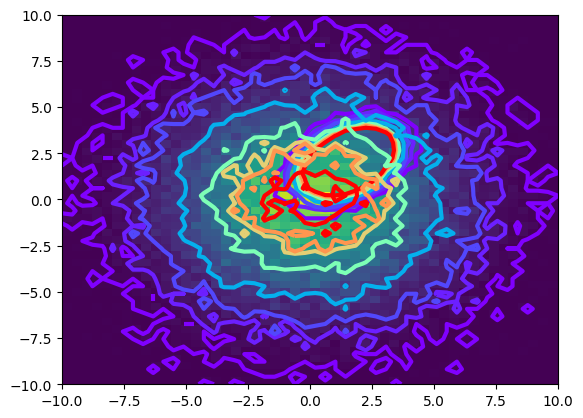
The signal and background data is shown below, as a contour plot. The data located at \(0,0\) is the background, and the offset (at \(3,5\)) is the signal. As you can see, there is substantial overlap making it quite hard to separate the signal.
def plot_contour(data):
    counts,xbins,ybins,_ = plt.hist2d(data[:, 0], data[:, 1], bins=50, range=((-10, 10), (-10, 10)))
    plt.contour(counts.transpose(),extent=[xbins[0],xbins[-1],ybins[0],ybins[-1]], linewidths=3, cmap = plt.cm.rainbow, levels = [1,5,10,25,50,70,80,100])

plot_contour(signal_data)
plot_contour(background_data)

Build the training and truth data. Keep the testing and training data the same, and the full data sample.
all_data = jnp.concatenate((signal_data, background_data))
all_truth = jnp.concatenate((jnp.ones(len(signal_data)), jnp.zeros(len(background_data))))

training_data = all_data
training_truth = all_truth

testing_signal = signal_data
testing_background = background_data
Build and train a simple fully connected network#
First define the network. We will use a simple fully connected network, with 6 layers. With extended training this has been shown to do quite well.
def FeedForward(x):
    mlp = hk.nets.MLP(output_sizes=[2,15,30,15,1])
    return mlp(x)

model = hk.transform(FeedForward)
The training is coded in the jax_helpers module as we will re-use it a bit!
params = train(model=model,
    key = key,
    epochs = 2000,
    training_data=training_data,
    training_truth=training_truth)
NegLogLoss : 450086.47, epoch: 1
NegLogLoss : 440696.31, epoch: 200
NegLogLoss : 440081.97, epoch: 400
NegLogLoss : 439911.62, epoch: 600
NegLogLoss : 439681.22, epoch: 800
NegLogLoss : 439556.62, epoch: 1000
NegLogLoss : 439498.31, epoch: 1200
NegLogLoss : 439461.06, epoch: 1400
NegLogLoss : 439316.72, epoch: 1600
NegLogLoss : 439217.06, epoch: 1800
NegLogLoss : 439092.69, epoch: 2000
Going from a simple optimizer to the Adam optimizer in optax meant going from what looked like a very simple triangle cut to a circle below. And also going from training on 30K epochs to training about 1000 times (and it looks like we might have been done at 500 too).
I suspect we could have used a simpler network as a result of this as well.
Examining the Training#
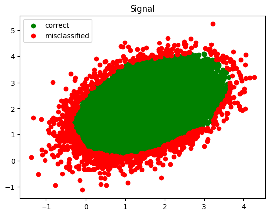
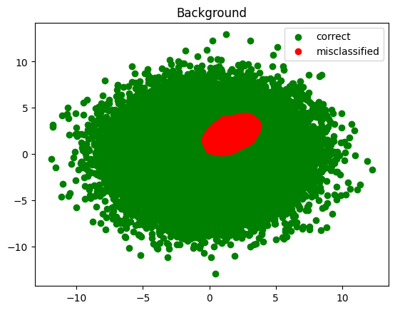
Lets look at this graphically, showing a scatter plot of good and bad. First the prediction!
def infer(data):
    test_preds = model.apply(params, key, data)
    test_preds = jax.nn.sigmoid(test_preds.squeeze())
    test_preds = (test_preds > 0.5).astype(jnp.float32)
    return test_preds

infer_signal = infer(testing_signal)
infer_background = infer(testing_background)
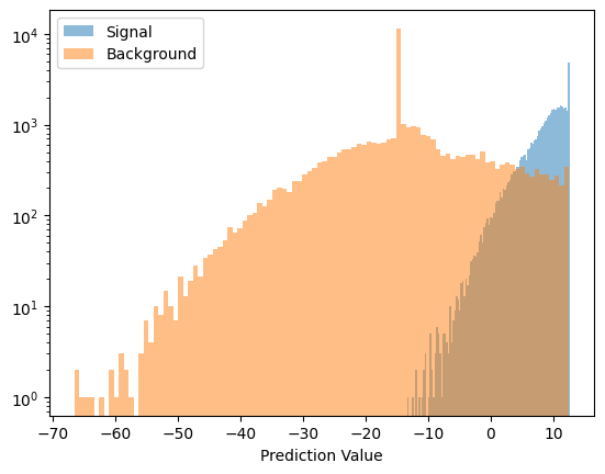
And the signal and background prediction values
def plot_pred(data, name):
    preds = model.apply(params, key, data)
    preds = preds.squeeze()
    plt.hist(preds, bins=100, label=name, alpha=0.5)

plot_pred(testing_signal, 'Signal')
plot_pred(testing_background, 'Background')

plt.yscale('log')
plt.xlabel('Prediction Value')
plt.legend()
plt.show()

Next, plot the classified signal and background
def plot_inference(data, results, value, title):
    good_data = data[results == value]
    plt.scatter(good_data[:, 0], good_data[:, 1], color='green', label='correct')
    bad_data = data[results != value]
    plt.scatter(bad_data[:, 0], bad_data[:, 1], color='red', label='misclassified')
    plt.title(title)
    plt.legend()

plot_inference(testing_signal, infer_signal, 1.0, 'Signal')
plt.show()
plot_inference(testing_background, infer_background, 0.0, 'Background')
plt.show()


